Came across these designs on the internet. Do any catch your eye?
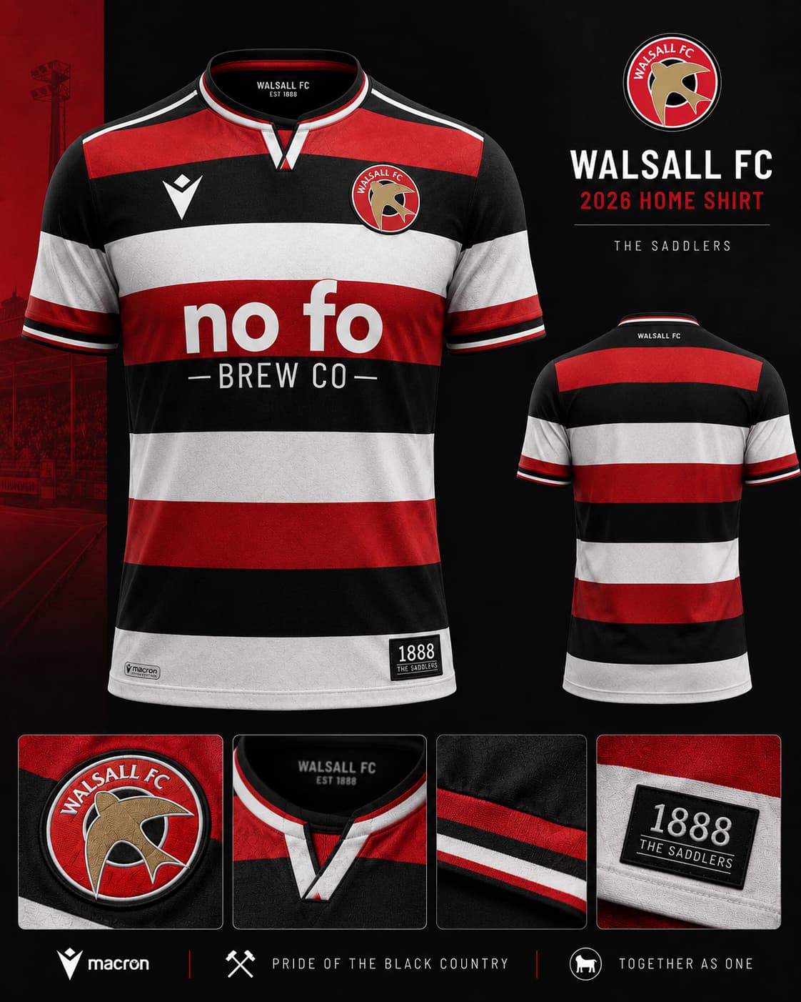
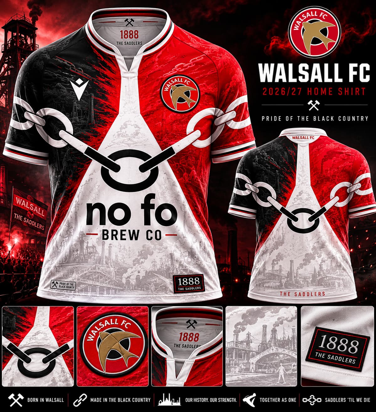
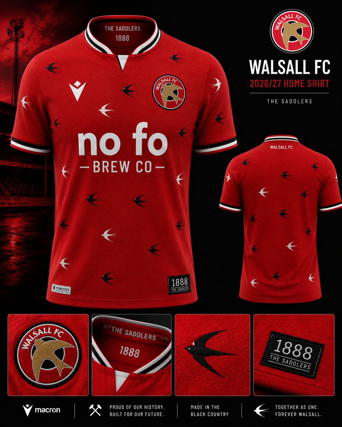
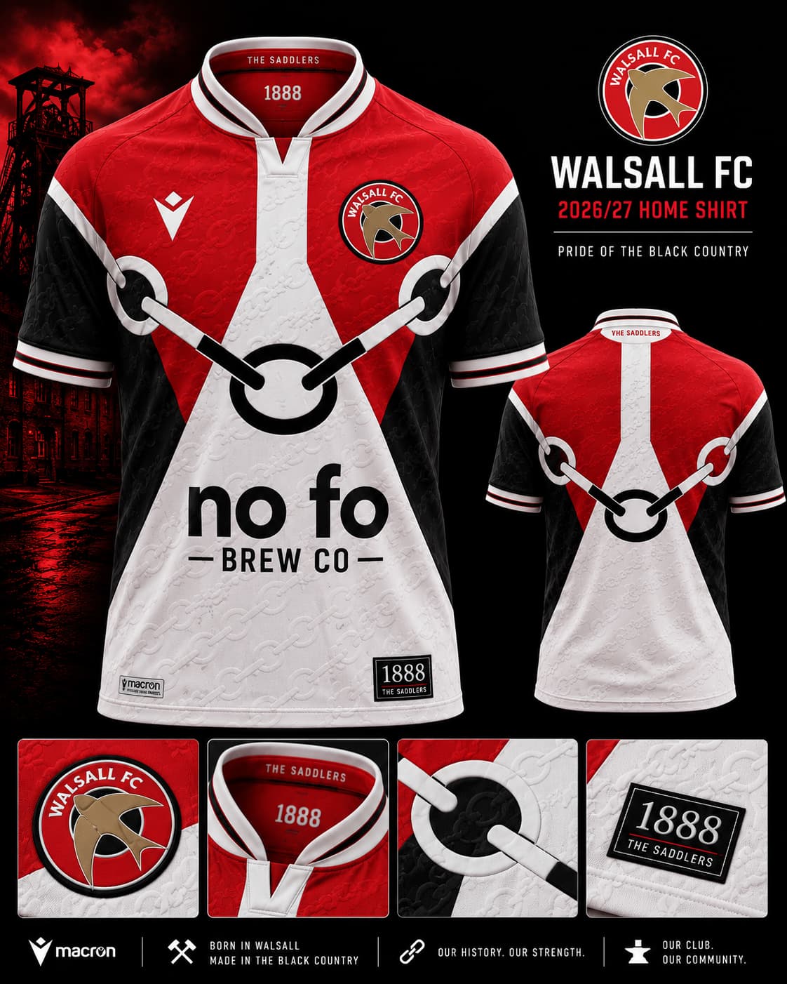

Also, not sure why black has crept into the kit as a staple.
1 Like
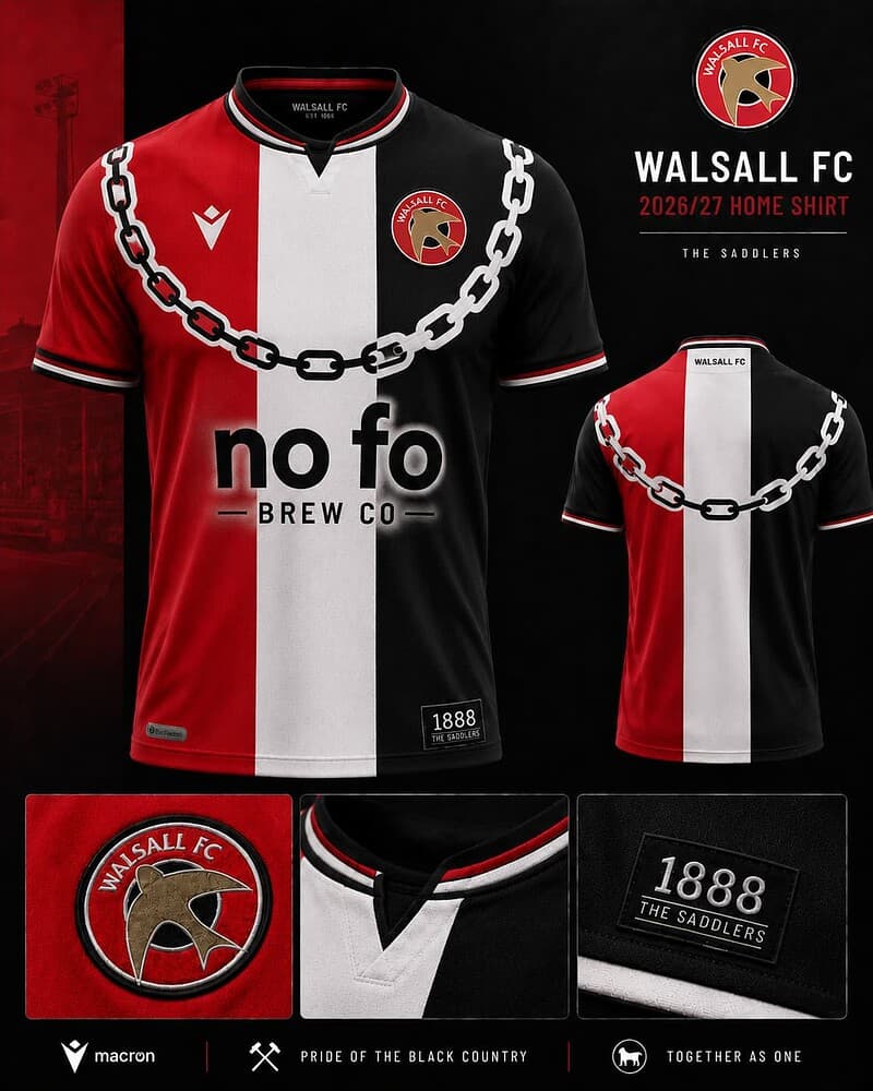
Are these a joke? ![]()
9 Likes
Where on the web?
Or did you create them? Not keen on em personally but impressive if so…
I could live with the swifts one, with a few adjustments. The others are pispotical.
1 Like
Might have been playing around with AI ![]()
1 Like
The swifts need to be in the ascendancy!
1 Like
These are hilarious
I was thinking Ali G.
Big up the Bescot Massive!
Boyakasha! ![]()
1 Like
Enough internet for me tonight ![]()
1 Like
They all look crap
3 Likes
Interesting that Wendy Mumford usually does this……
1 Like
Wouldn’t buy any of them. I didn’t like last season’s home shirt. In fact I haven’t liked a home shirt for yonks. I bought the blue away shirt which had a V neck and which I thought was tasteful. First shirt I’ve wanted to buy for years. I think it’s time we had something modelled on the 59/60 shirt or 65/66/67
Jesus, those are dreadful.
1 Like
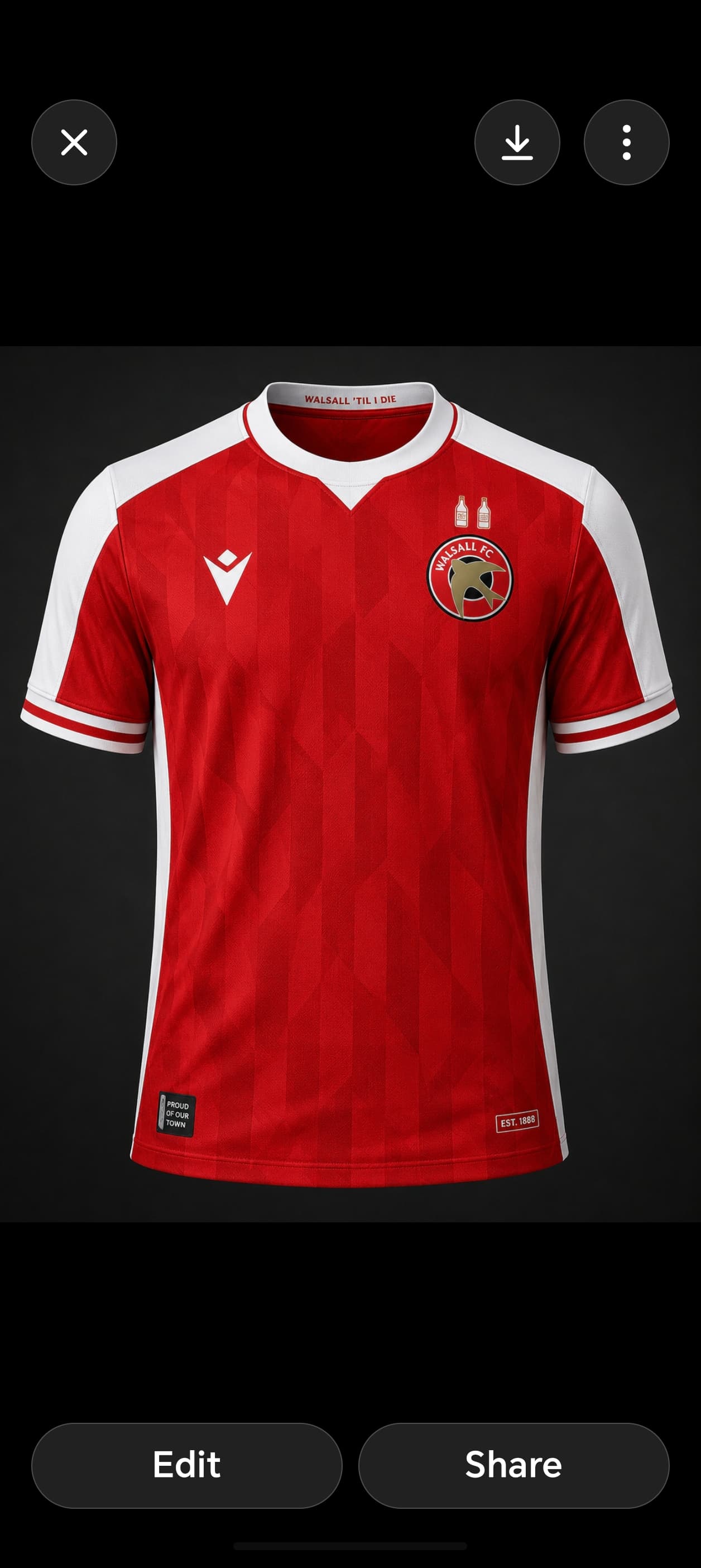
Love the double bottles above the swift ![]()
10 Likes
I mean no offence to anybody who likes the artwork created by AI. However, as someone who has been brought up valuing personal creativity and art, I absolutely detest it.
In my eyes, they are the standard of the naughty cartoon postcards you could get along seaside promenades in the 1980s. Truly ghastly and tasteless tosh.
Each to their own though! ![]()
2 Likes
My missis really liked the first one! ![]()
![]()
3 Likes
Defo AI - wouldn’t want to see a Walsall side in any of those atrocities