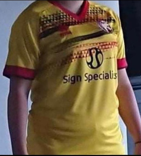
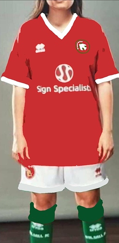
That’s apparently the ladies team kit so it will have a different sponsor I’d imagine. Especially as Sign Specialists are owned by one of our directors.
I like the idea of having green in the kit but I’m not keen on that design. Think they’ve tried to be too clever. Has a Santa’s Elves vibe about it. 
That explains the sponsor. I agree about the kit, I would have had a plain red top and the green socks like the old kit. A bit too much green on the top. I’ve just noticed the green on the shorts too. Again for me plain white shorts. It is nice that the green is back.
I won’t complain as it is magic to get the green back. I think the merch will fly with the green reinstated in the scarves, flags etc.
I do kind of agree though. They’ve taken the original Umbro 77-78 as the template by the looks. Whereas the one we all fell in love with was the subsequent Adidas one where the green was contained to the socks and badge.
But overall as a green campaigner I think it’s ace and if the green is back for good then it can iterate over the next few seasons.
That’s what I’m thinking. They’ve gone a bit too mad with the green sticking it everywhere.
I’d prefer:
Red shirt / white trim
White shorts / red trim
Green socks / white trim
Basically red and white with a bit of green.
Banish the black from Bonser days which means also getting rid of it from the badge. I like the new badge but I thought the gold was originally supposed to be a one off to celebrate an anniversary? Swift needs to go back to white.
If that is the new kit it reminds me of the season we went back to white shirts and they came up with some fancy design. The one that was made out of weird material and had the conservatory sponsor that came off easily. That season they finally listened to fans but the execution was poor.
We generally just want something classic and retro and not too cluttered.
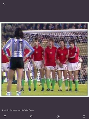
Ok, I’ve resisted until now, but it’s been at least six months since I last posted my favourite international photo ever. Had our best home and Away kits in my time. From the 1978 World Cup when I was thrilled to see Walsall (H) versus Walsall (A) .
Fair play to the club for going green! We’ll have a unique colour combination next season, which is always good. This strip does look a bit fussy to my eyes at first view but I guess the club had only a limited number of templates to choose from.
Nevertheless, it’s a good effort.
Looks like a 90s Swindon kit. Horrible
“Watford fc, from the black country!”
Not keen on the green combo but could grow on me…
I prefer green in the badge.
If we’re talking badge designs, here’s one I made earlier…

Not bad.
Nailed it.
Away kit is straight from 2004 too.
Not good. Whoever’s in charge of these designs has a lot to answer for.
I live in hope those aren’t real
I actually like our latest design , I know the black and gold makes us think of the six fingered bunch down the road but hey , can’t stand how clubs keep changing their badge designs it sort of doesn’t feel right to me .
Be easy to get similar looking tops at a fraction of the price. 


