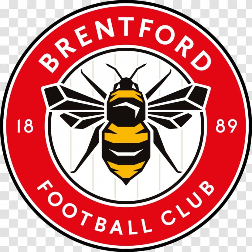
Found this Badge on twitter quite impressed with it. Got me wondering is it time to upgrade our badge always found ours quite bland and looks like it was designed by a 5 year old.
2 Likes
No because it’s Stevenage’s badge with a different insert in the middle.
Decent enough effort though, better than Solihull’s new one.
4 Likes
Haha thought it looked familiar ![]()
1 Like
Similar to Bristol City too
I think we need something proper unique and futuristic like our club and board x
A holographic logo?
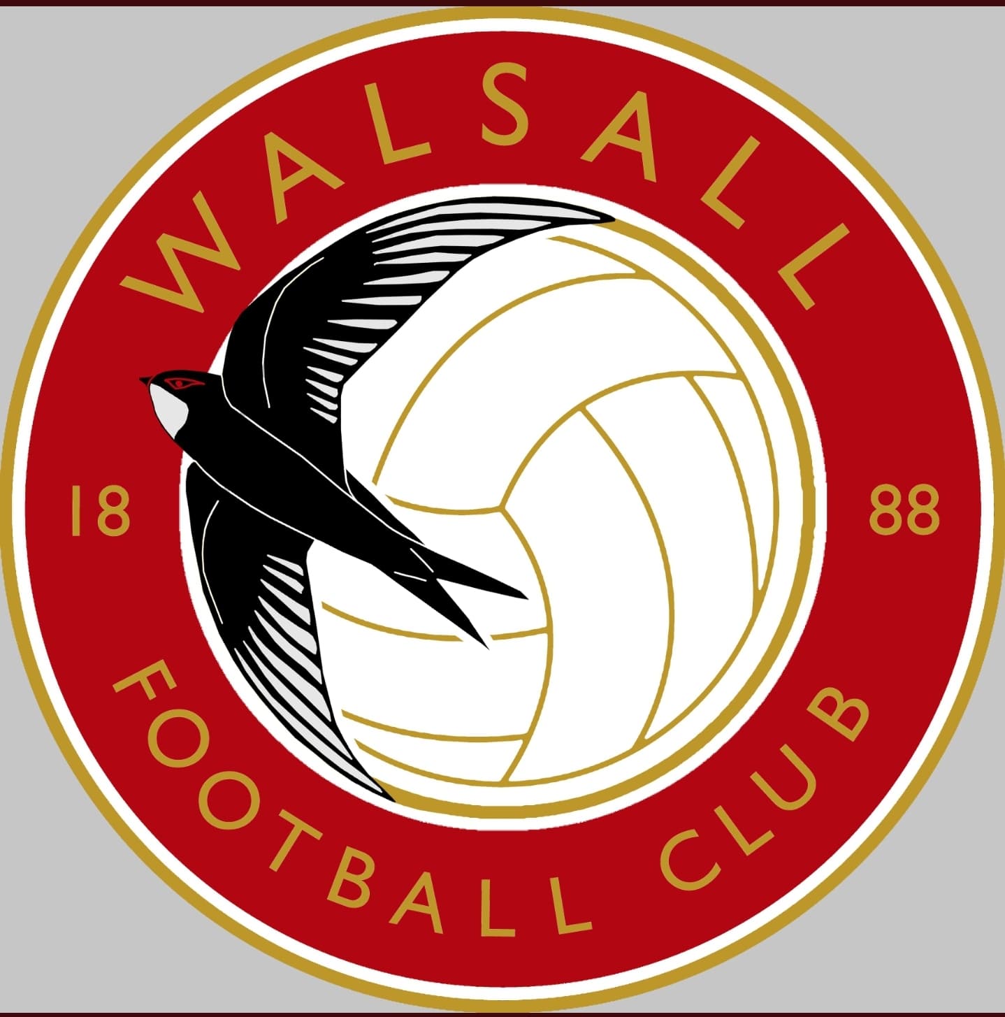
Must admit I really like our badge , much better than previous ones , and yes it is simple and plain but that’s the reason I like it .
Much like how the dogs head badge is simple , but most recognisable for the six fingered lot.
2 Likes
Looks like a deflated football and reminiscent of our recent deflating seasons
The last two times we’ve changed our badge it’s coincided with us getting out the bottom division
Mid 90s under Nicholl we moved to the shield
Mid 00s under Dosh we went back to the round badge
Mid 2023 ……
…We get promotion and keep same badge … ![]()
That’s a classy badge. We really need to change that poor effort we’ve been stuck with for years. We had an excellent badge in the sixties too, the one with the lions either side of the shield, I think something like that was used on those Esso badges that came with petrol at that time. I remember we used to linger around the filling station on Pleck Road and pester drivers when they filled up, asking for the free badge.
It’s interesting how tastes vary so much with regards to badge design, and shows just how difficult it is to please even a slight majority, much less everybody. This is why it should be kept simple.
For me personally, I prefer a sans-serif typeface like that seen in the ‘shield’ badge and the ‘roundel’ badge before it. I don’t like having gold in any shape or form on there, not just for the obvious neighbourly association, but because next to red it puts me in mind of a tin of luxury Christmas biscuits. For the same reason I’d bring the shade of red on @Peel85’s badge a shade or two lighter.
Having a football on the badge is a tautology if the words “Football Club” or the letters “FC” are to be included, which they should be, so I’d get rid of that as well.
1 Like
I’d agree with all of that. I really don’t like our current badge and hope that should the club decide to change it in future there is some sort of fan consultation on it.
Yes I’d agree about the gold, it should be white. The swift itself looks like a proper swift, and does justice to our original name, unlike the present ambiguous inaccurate hirundine. Up Walsall Town Swifts.
How about something with a bit of class?..
1 Like
LOL screams class that does. Maybe is missing a busty female or Male if thats you bag, throwing cash at the birds
I was looking through ebay… late night trawl… and our old cicular crest with the swift going down looked much better. Any one know why we changed it to going up?
Changed at the end of the 94/95 season, presumably to signify promotion after a spell in the fourth tier.
That shield type all coincided with the shop opening in the Town Centre and a bit of a rebrand. I’m sure the story went that that the text / font was taken from some old pendants that had been found ? And that the swift should be flying upwards. I’d hazard a guess this was a Roy Whalley idea. New Badge get everyone to part with a bit of cash.
One thing I do think was good about that shield type badge was the Leather symbol that sat in the back ground. Shame that this couldn’t be incorporated in to the current design.
1 Like
I thought it was Roy Whalley who came out and said the new badge with the swift going up instead of down was to signify the way the club wanted to move.
All said I do like the badge we have now, it’s not too busy like the old one and hate how clubs keep changing them anyway, hope we stick with this one now, and the club keep moving in an upward trajectory.
1 Like