I’m hoping this isn’t logit. Both are awful.
1 Like
Na I’m sure that was maybe my mate Westie who said it was thin black stripes….![]()
![]()
1 Like
You also said it was nice ![]() that’s subjective though I suppose
that’s subjective though I suppose
I quite like the home kit.
Away kit is ehhhh, the yellow is icky
They decided to consult dabs with these, which sounds like a good idea initially.
But when they did, they picked a very small amount of fans to give their ideas which risks something like this happening.
All they had to do was keep our traditional colours and not go too radical with the design.
I thought it was yellow, but on closer inspection it appears to be gold like the swift colour.
They didn’t consult on the kits as such
1 Like
It’s hotdog mustard with ketchup, running along a foot long.
2 Likes
It’s f***** sh**.
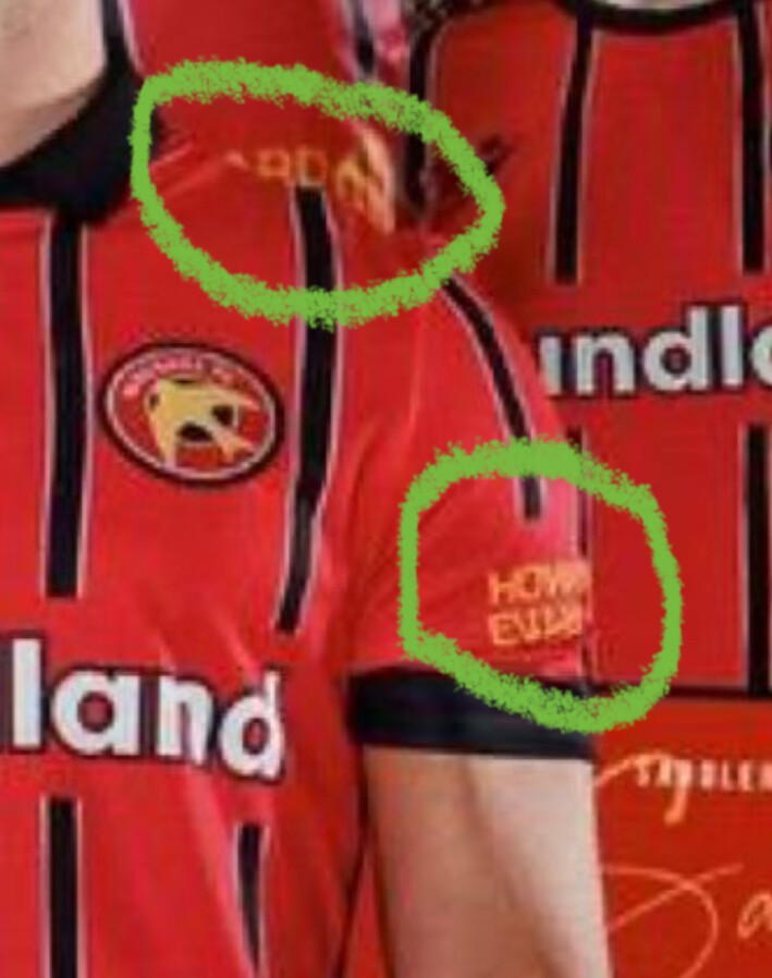
Howard Evans roofing I would say…
It shouldn’t be hard should it, our colours are red and white, not red and black, I don’t mind red and white with a bit of the black or green in but f me the only white on that top is the Poundland writing.
4 Likes
Colours are okay on the home.
Design is horrible
Away design is ok but the colours are just horrible. Black and red ok. Green and red ok black and green. But yellowy gold no thanks.
But as long as we win I don’t care.
The kit will be adored if we get promoted.
Designed in Milan!
1 Like
Shouldn’t that be ‘by Milan’? ![]()
Il check twitter and see if he likes them ![]()
Surely this is a wind up?
They are awful.
2 Likes
No, i said it was a thick yellow stripe, just like the one that runs down the middle of your back.
2 Likes
![]()
![]()
![]()
![]()
![]()
![]()
![]()
You’re not very nice mate