Always hated the black aspect on our shirts in the past, not for me I’m afraid, not individual enough, wreaks of relegation sides, don’t know why, but just does.
And the green second string kit we have is utterly appalling, the white tops red shorts combo has been a roaring success this season.
No black for me. No black in our colours, hate it. Also the gold and black one - what are they thinking?
That definitely looks more like training gear to me. Not that keen on it but if we don’t see it on the pitch then not really a problem to me.
At least they got real people to model it and not just stick it on mannequins or on hangers!!
Christ almighty, not green again, unless it’s a keeper’s top.
… unironed, fresh from the packet, against a concrete block wall backdrop.
Or just a pdf
Stay classy San Diego!!![]()
![]()
27th April unveiling!
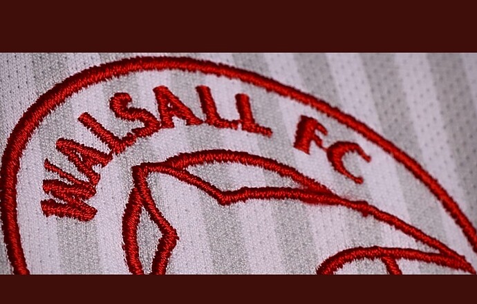
Not sure about the shirt or the badge from that picture
As long as it keeps the same theme for the rest of the shirt, without any additional colours i will be happy ![]()
No gold & black, looking good so far.
Looks like it could be an updated version, would be a good move for the club to make.
Not liking any of the new kits.
Playing in all red and ditching the white shorts.
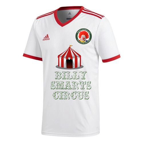
Stick them up your ring piece with that on the front. Who came up with the font?
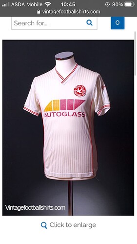
The white one is really nice apart from the random side red bits.
Home kit was designed on Pes 5.
Would have looked better if the sponsor was red and we wore red shorts with it.


