Maybe we are looking to attract more Polish fans.
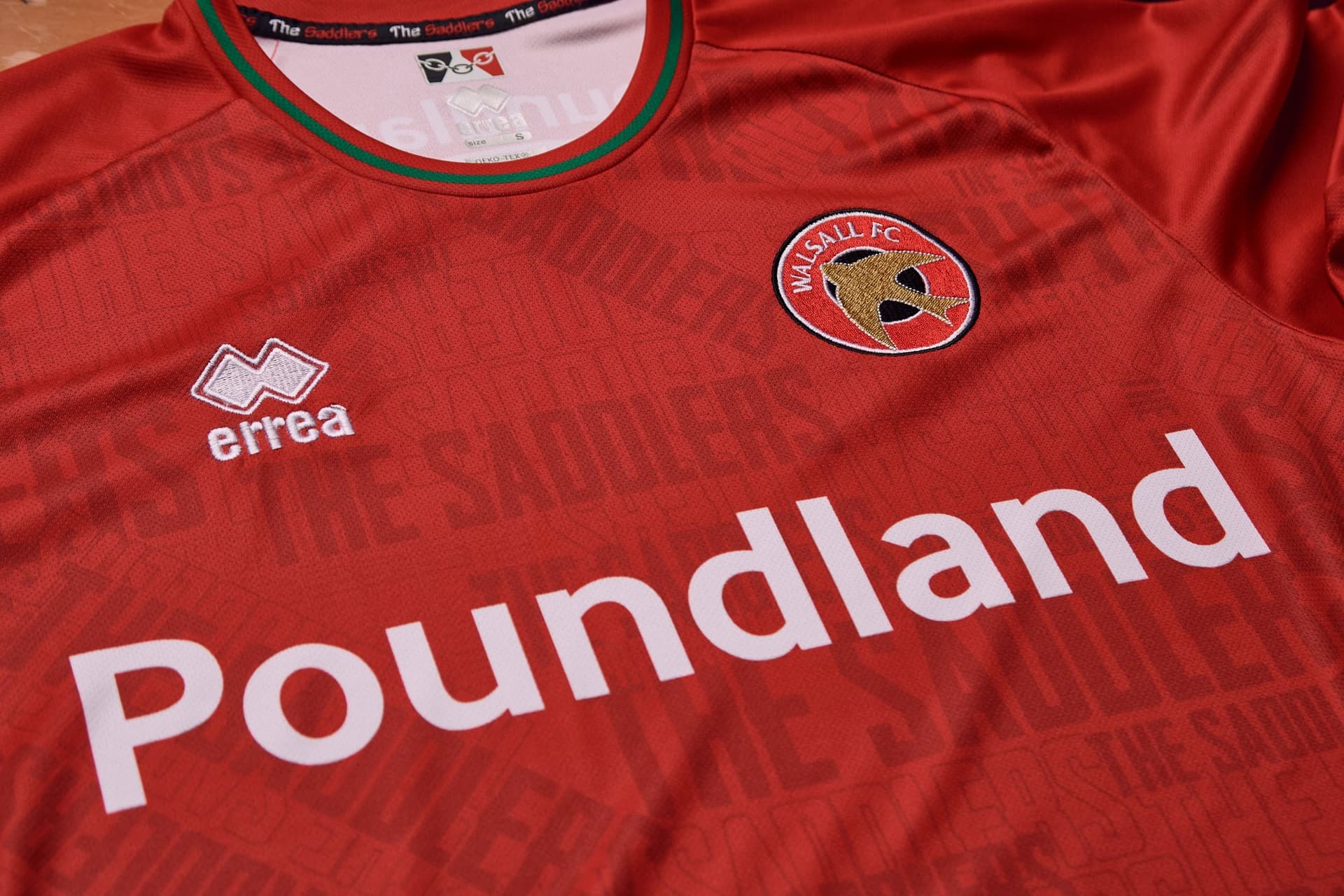
Warsaw with a sponsor of POundLAND
Away is the pick of the bunch. Its like our 88 autoglass one.
Home and Third are ok.
1 Like
The amount of green is decreasing which is great, hopefully gone entirely next season, but having Poundland on it ain’t going to help sales.
1 Like
Good to see us finally make use of our nickname all throughout the home kit design.
The white and red kits would be much better if they swapped shorts. I am not a fan of us in all red. Red tops, white shorts and white tops red shorts should be the combos. 3rd choice looks ok.
2 Likes
Cant wait to tell my dingle and vile mates our new shirt sponsor is Poundland , they already tek the piss
Hate the home shirt. ‘The Saddlers’ print is horrible.
The second and third shirts are nice though.
Ermmm I think I will leave any of the shirts alone next season.
Home Kit - bog standard 5/10
Away Kit - Decent growing on me 7/10
Third Kit - Ok 6/10
Overall slightly disappointed.
1 Like
In my honest opinion and Sponsor aside, the kits are rubbish and look cheap as per usual.
2 Likes
Don’t mind the kits, sponsors are obviously a financial thing.
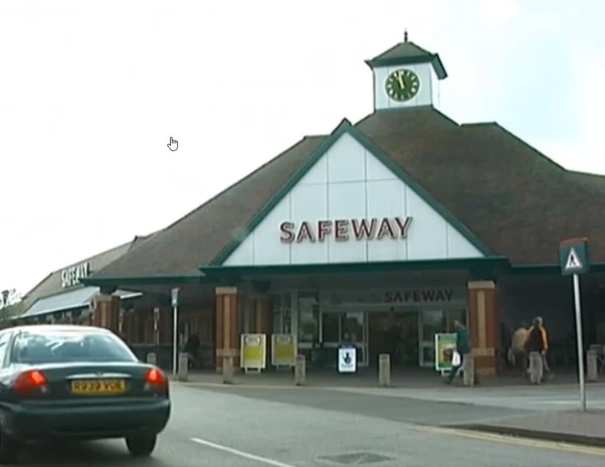
But away shirt is giving me major Safeways vibes with the colour palette.
1 Like
Are you that bothered? Serious question.
You’ve just said they already “tek the piss”…. so how is it going to be any different? ![]()
1 Like
Indeed. I have lots of friends/ colleagues that support bigger clubs.
The vast majority give total respect to the fact that I support a lower league club.
If they didn’t I’d let them know about it.
Never ever have I felt either ashamed or second class about following my club.
6 Likes
The away shirt is growing on me due to the obvious nod to the 88/89 auto glass shirt the others I’m still not sure about
1 Like
To be fair I don’t think they’ve been as bad in recent years but that home kit is rough. When you see it up close looks like it was designed by clip art
3 Likes
I feel the same. I can look past the sponsor particularly as they chose to just have the name rather than that awful green rectangle logo.
But the kits themselves look cheap. The little gimmicks like the “Saddlers” in the material, “paintbrush” strokes on the 3rd kit and making the badge on the away kit different make them look like knockoffs/cheap tat.
Having solid colours with a bit of a retro look and proper collars would look much better. This looks like Mole has gone through the Errea catalogue, seen these little extras and gone “Wow, the Walsall fans will think this looks well cool and down with the kids!” ![]()
1 Like
Why are some of “The Saddlers” bits in the material upside down and even backwards? ![]()
![]()
![]()
Ultimately if we win the league in this kit 20 years on it will be released as an iconic retro shirt.
Highly unlikely but my pre season optimism has already kicked in.
2 Likes
I’m with you Killer, away shirt is the best of a rather dissapointing bunch. Expected slightly better but will still no doubt purchase all 3.
1 Like